A solid understanding of graphics can help you avoid work that looks sloppy and turns people off.
Types of graphics
Graphics can be separated into two broad categories: raster and vector.
Raster graphics are like graphing paper. ALL digital photos are raster. By filling in the blocks on a sheet of graph paper, you can make an image. The smaller the blocks, the more detail. The more detail, the more you can “blow up” the image without the small blocks seeming too large.
With increased detail — or resolution — comes greater file size. That means you can potentially crop and enlarge a graphic, like a logo or clip art, without losing so much detail that you’d notice.
The 800-pound gorilla of raster graphics is Adobe Photoshop. Typical raster formats are .jpg, .gif and .png. ALL web images are raster images. Because they are a rendered, or “flattened,” format, they don’t have layers. All you have are those little squares, so if something like a document is in a raster format
Vector graphics use mathematical algorithms to make the curves and lines that form an image. By doing so, a vector graphic will maintain the same level of detail whether it’s on a pencil or spread out across the side of a stadium. Generally, vector graphics are the realm of designers.
Common applications that use vector graphics are Adobe InDesign and Adobe Illustrator. Typical vector formats are .eps and .ai. ALL fonts (even in Photoshop) are vectors to start with.
It’s possible to “trace” a raster graphic in Illustrator and convert it into a vector image, but it can be laborious. Vector images can be rendered out into raster images very easily.
Common pitfalls
The two most common — and avoidable — mistakes with raster graphics are:
- Using an image that is too small for the presentation format (print or screen, large or small)
- Failure to maintain the correct aspect/proportions when resizing
Size matters when it comes to graphics. If you find a graphic (like a logo) online and intend to use it, download it and look at the file size. Something in the range of 20k is really too small to use for much of anything. Once you get up around 100k, you’re in the realm of something with adequate detail.
But without even doing that, a best practice in web design is to not make graphics any larger than they need to be to look good, lest you force longer load times and more data. It’s sort of rude to use graphics that are bigger than they need to be. So next time you want to use a web graphic, look at it in its current context. However large it is on the web page, you probably can’t get away with making it much bigger.
When resizing graphics, use the corners and hold down the SHIFT key as you resize. This keeps the correct proportions in virtually any program that uses graphics.
Transparency/alpha channels
Say you want to drop a logo into a document that normally is all by itself, but the version you have comes on a white background and you don’t want that.
All vector graphics support transparency, but again, you won’t work with those much so we’ll focus on raster graphics. In your world, the only high-res raster file format that supports transparency — also called an alpha channel — is PNG (portable network graphic). GIF (graphic interchange format) also supports transparency, but generally is used for small, low-resolution images like icons because it only supports 256 colors. JPG does not support transparency.


Finding graphics
Google “free clip art” and you’ll get dozens, maybe hundreds of results for various search engines. Microsoft used to have a dedicated website for its clip art collection, but now that functionality is built into most MS Office applications on PCs, but Mac is a bit dicey. In any event, most of their old and updated collection is searchable on Bing.
However …
What you probably think of as clip art is hardly used anymore. The only reason it came into favor was because early color displays could only handle so many colors, and companies who made clip art could put thousands of the little graphics files on CDs, which eventually proliferated. Clip art is low-res raster graphics. You don’t need to live this way.
If you don’t want to draw something or use a photo, what you probably want is some little graphic representation, just to jazz something up or break up long blocks of text. You probably don’t want to spend half the day finding a graphic large enough to practically use. What you want is a typeface, or font.
Fonts as graphics
On your computer, right now, are at least a few fonts known as dingbats. Basically they’re just little pictures, each mapped to a key or key combination. (NOTE: to find a character map, go to Start Menu/Programs/Accessories/System Tools on an older PC or use these instructions on Windows 10. On a Mac, depending on the application, you can go to some variation of Insert>Symbol, choose your font, then see what symbols are available within it.
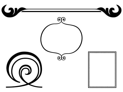
The great thing about dingbats is that you can make them as large as you want and change their color without losing detail. They’re vectors! Find a bazillion of them at dafont.
The humble icon
Icons are big on the web, but also in print. They’re a good way to group something together, like a little camera icon for things photo-related, or a bolt of lightning for something that goes fast. Part of the reason they’re popular is that any app on any phone is activated with an icon. You can (and should) use them, too.
Most icons that you see now are “flat,” meaning clean, un-beveled lines and no effects like gradients or drop-shadows that create an illusion of depth. It’s a form-follows-function thing.
One of the most useful websites out there is flaticon, an outstanding source of vector icons that you can download as vector or raster at virtually any size, and in any web color. On top of that, the interface is clean and relatively intuitive, and there’s no account needed. What’s the catch, you ask? Really, just attribution via link. Small price to pay for so much great stuff. You can even download an icon of a person being impaled by a unicorn, should the need arise.
More graphical graphics
If fonts and icons aren’t quite enough and you need something more along the lines of print-ready artwork like banners and complex designs that you can just drop into a project, look no further than flaticon’s big sister, freepik.
As with flaticon, freepik seems too good to be true.Here’s a simple example of what you can get merely for attribution by link:
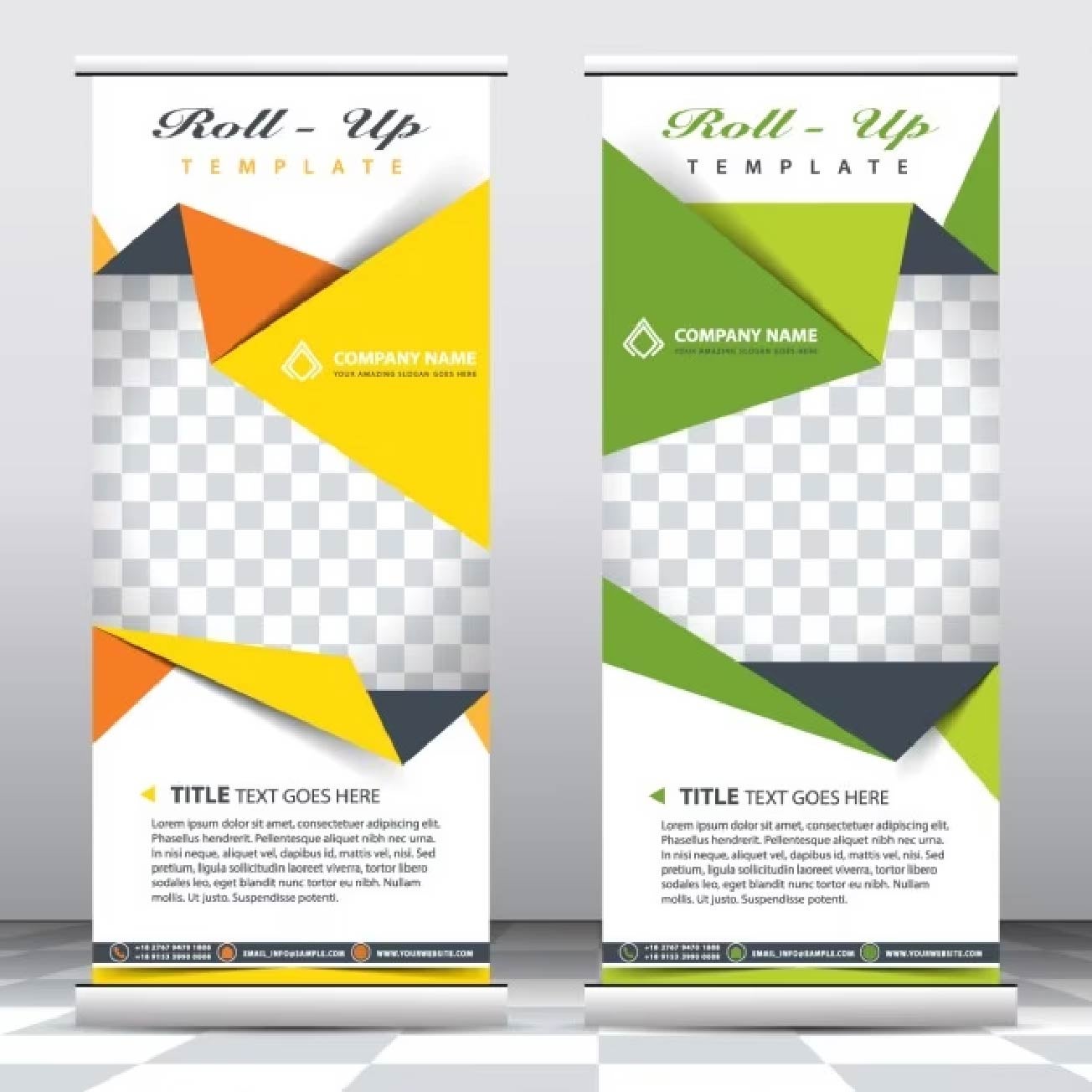
Pretty cool, right? Now, the kicker is that these are vector graphics, therefore you need a vector program like Illustrator or InDesign to work directly with the .eps and .ai files on this site. However, you often get (as with this example) a .jpg also, and with a little know-how you can lose the text, fill in the spaces where the text was, then overlay your text on top of it.
Doing your own graphics
You either have some design sensibility or you really don’t. Most people know this about themselves. If you don’t, it’s okay. Underpaid people with 27″ iMacs are available to help.
If you don’t have access to them and their talents, you’ll have to fake it. Check out 20 tips and hacks for non-designers for some great suggestions. From our view, here are the essentials:
- Keep it simple, especially the number, style and weight of typefaces (sans-serif is safest)
- Favor fonts and icons over clip art
- Stay contrasty: very light background, very dark text or vice-versa
- Everything should be in line with something, particularly the tops and left edges of things. Think in grids and boxes.
- Basic geometric shapes work great
- Understand transparency/opacity/layer order and use it
- Don’t use “fill patterns.” Ever.
- Use as much white space as possible; resist the urge to cover the page with stuff
- Solicit the opinions of candid people