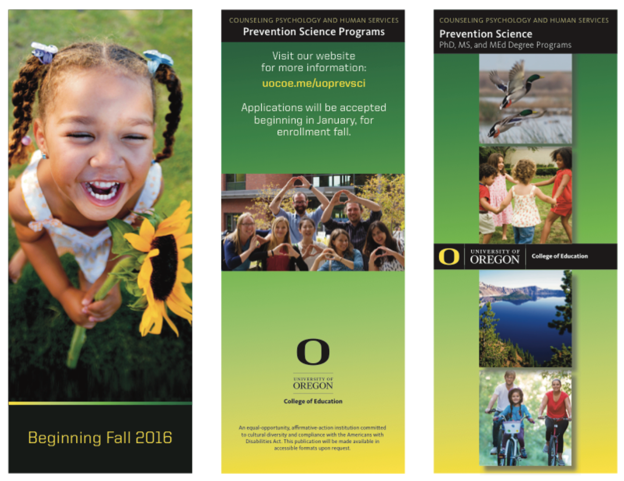
A brochure is one of the most basic tools for disseminating information. Typically it’s a folded piece, and more typically it is a trifold or bifold. Flyers are usually just a single unfolded sheet with basic information, such as an event. The only thing that really makes a poster different from a flyer, in our opinion, is size and paper stock. Posters tend to be larger (11×17+) and on a heavier stock.
For most, brochures are low-hanging fruit. Unfortunately, they often are the only piece of collateral an organization can afford to create and print. That makes them an important tool to understand, but they should be just one part of a broader marketing mix. After you’ve made a brochure, you are not done.
The key phrase about brochures (or flyers, or whatever) is this: It doesn’t matter if you like it; it matters that it works.
It doesn’t matter if you like it; it matters that it works.
What’s the point?
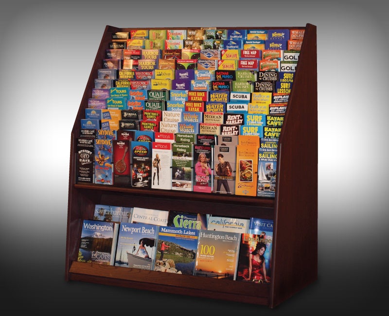
The lobbies of cheap hotels are filled with brochures. An entire rack of them, each shinier than the next. Since you’re not a go-kart track or a canoe-rental place you won’t be competing with those, but that brochure rack is a metaphor for all printed pieces: There are many, and they’re basically all the same.
The purpose of your brochure is straightforward: Interest people in your thing. But it’s not just any people, is it? It’s people who are:
- physically near your thing;
- receptive to information about your thing (“in the market”), at that moment;
- interested enough to pick up your thing and invest several seconds reading it;
- and convinced to act.
As you can see, your actual audience is very, very small. Let’s see how you can maximize it.
Design
Brochures have three main design objectives:
- Simple
- Attractive
- Connected
Amateurish artwork tries to do too much: drop shadows, outlines, 4+ fonts, etc. Think about a tone and aim for it. If it’s serious and professional, use darker colors and basic geometric shapes, favoring rectangles and simple lines. Use sans-serif fonts. If it’s edgy and innovative, use brighter colors and bolder layouts. Choose fonts that are maybe a little different, but still super readable. Design serves a higher purpose, but you have to know what it is.
If you don’t know what you’re doing, work off a template or hire out. You’ll be glad you did. If it doesn’t look good, there are negative connotations for the organization (or the thing) and that costs you more in the end than good design. And unless you’re a designer or art director, it’s not enough for you and your colleagues to “like” it. Show it to someone who knows design and layout, and trust what they tell you. If you ask nicely, they might even help you make it better.
If you operate within a larger organization, there probably is a design language and particular set of typography that you should use to show a connection back to it. Marketing types at the home office will be happy to give you the info, and it tends not to change much over time. Leverage a larger brand as much as you can; it builds trust and recognition.
Conversions
Let’s say you satisfy the first three requirements and they’re ready to take action. Before you start work on any brochure, determine what you want people to DO in the unlikely event they read it and are convinced. Usually the goal is to get them to visit a website, register for something, call for information, come to an event, etc. These are called conversions in marketing-speak, but call them whatever you want; they’re actions.
A small business with very few marketing options might just put its main website on a brochure. It might then check its web traffic for a while to see if the brochure had any effect. But even if they see a spike in activity, they are only assuming it was from the brochure. Wouldn’t it be nice if they could know for sure?
Call URL short, and just see what happens
You’ve seen short URLs before: bit.ly, ow.ly, goo.gl, etc. They’re called short domains. They are super handy for shrinking a long string of characters, like if you need to text someone an article link. Many, though not all, offer the ability to customize the part that comes after the short domain, like ow.ly/spdg (not a real link). Taking it a step further, you can even buy a custom short domain like nyti.ms (New York Times) or di.sn (Disney). The domain costs you a few bucks a year, but it’s not necessary.
Our favorite is bit.ly, which has robust tools for its free account and a simple visual interface for metrics. If you assign a unique short URL to your brochure that doesn’t appear anywhere else, you’ll probably save space AND be able to see (in real time) whether anyone is typing that link in somewhere. So you might say bit.ly/spdg16 or something like that, so you know that anyone who followed that link got there as a result of that brochure. Pretty cool, right?
Printing
There are two basic kinds of paper printing: Digital and offset.
The kind of printer you have in your office is digital, and probably 98 percent of all the printing you’re likely to do, even if you take it to a print shop, is also digital. The main differences between them is volume, color accuracy, and the variety of media and inks/toners/varnishes they can accommodate.
Though printers exist that can print edge to edge (borderless), most print shops must take a larger design and crop it for this effect. So, for example, to have an 8.5×11 with edge-to-edge color, you’d design your piece to be 8.75×11.25 (1/8″ of space outside the printed area plus extra) and ultimately would either print it on 11×17 and trim, or print 2-up (two pages) on a 12×18, then trim. Print shops will charge you for the trimming, of course.
Your files — photos especially — should be at maximum resolution when going to the printer, and should be delivered in PDF format. Otherwise, the printer may not have the fonts you used, or may not have the same version of whatever software you used.
Did it work?
If you can show that a brochure drove traffic, attendance, or whatever, it will help you make a business case for better brochures or additional avenues down the road. If you’re going to make a brochure, plan to do it right and see if it worked for you — or don’t do it.